StoryBook - UI Component explorer for frontend developers
In recent days, UI Components have become building blocks of a website or an application. And these UI Components need to be examined and tested properly before building User Interfaces.
Interesting Facts about UI Components
- UI Components depend on each other.
- UI Components has to support lots of use cases.
- If we have consistent UI Components then creating User Interfaces is fast and easy.
Challenges while building/testing UI Components
- UI developers have to depend on business logic and need to perform multiple clicks/actions to see the component.
- Keeping track of multiple components is difficult.
Now, the question is how do we overcome these challenges? The answer to this question is very simple. We need some tool wherein we don’t have to depend on business flow or some sort of API’s.
And the tool is StoryBook
What is StoryBook?
- It’s an open source tool for developing UI Components.
- It helps to build components in isolation to application.
- It allows you to browse a component library, view the different states of each component, and interactively develop and test components.
Setup:
create-react-app your_project && cd your_project
After that, we can set up the storybook running the command:
npx -p @storybook/cli sb init
Now you only need to run:
yarn storybook
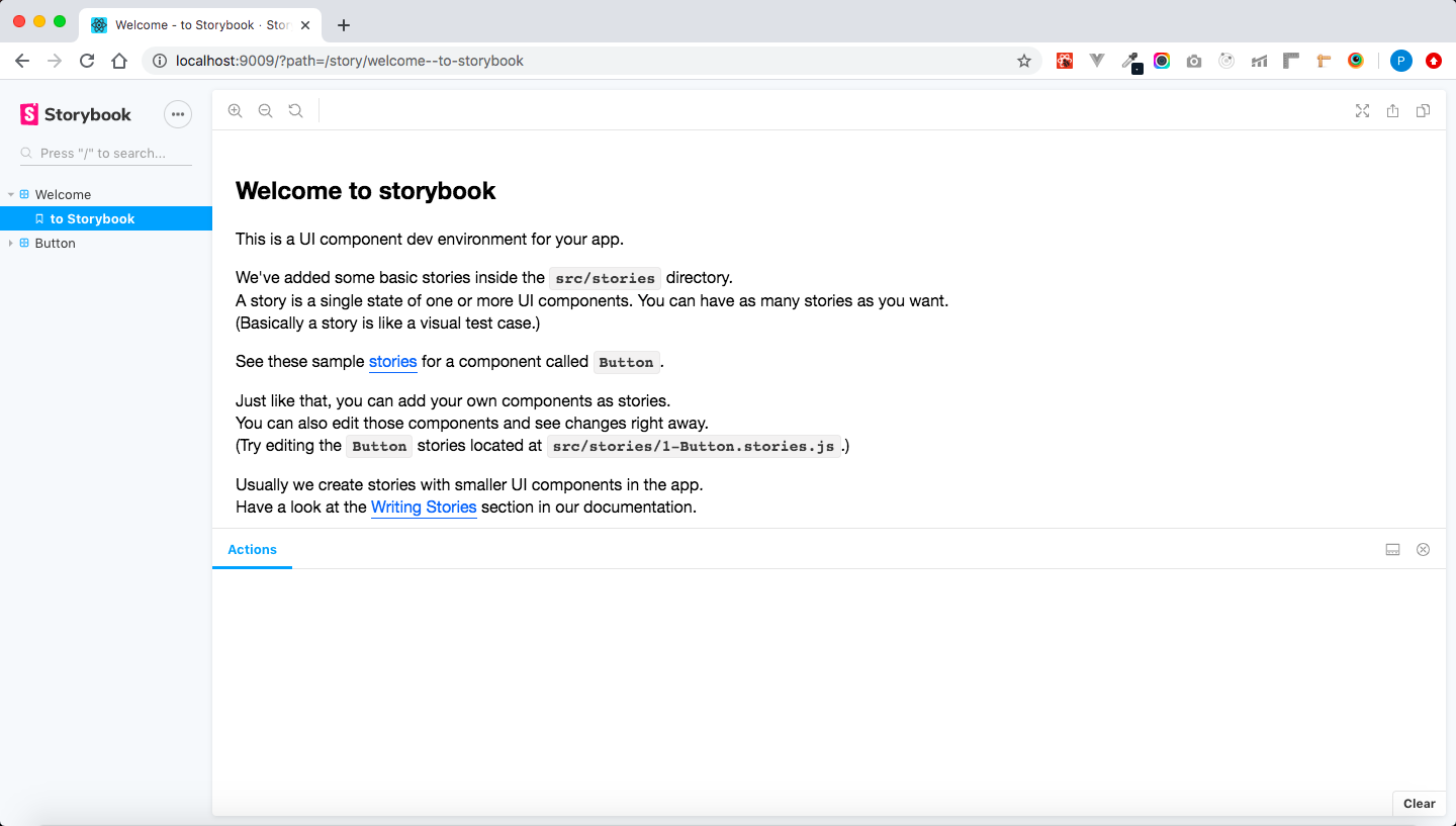
A local server will be created at http://localhost:9009 and you will see something like below:
Writing Stories:
Once we are done with the setup, let us see an example on how to write a story for a simple Button component in React.
But before we start writing stories we have to do some configuration as below:
- For a basic storybook configuration, the only thing you need to do is tell storybook where to find stories.
-
To do that, create a file at .storybook/main.js with the following content:
  module.exports = {
    stories: ['../src/**/*.stories.[tj]s'],
  };
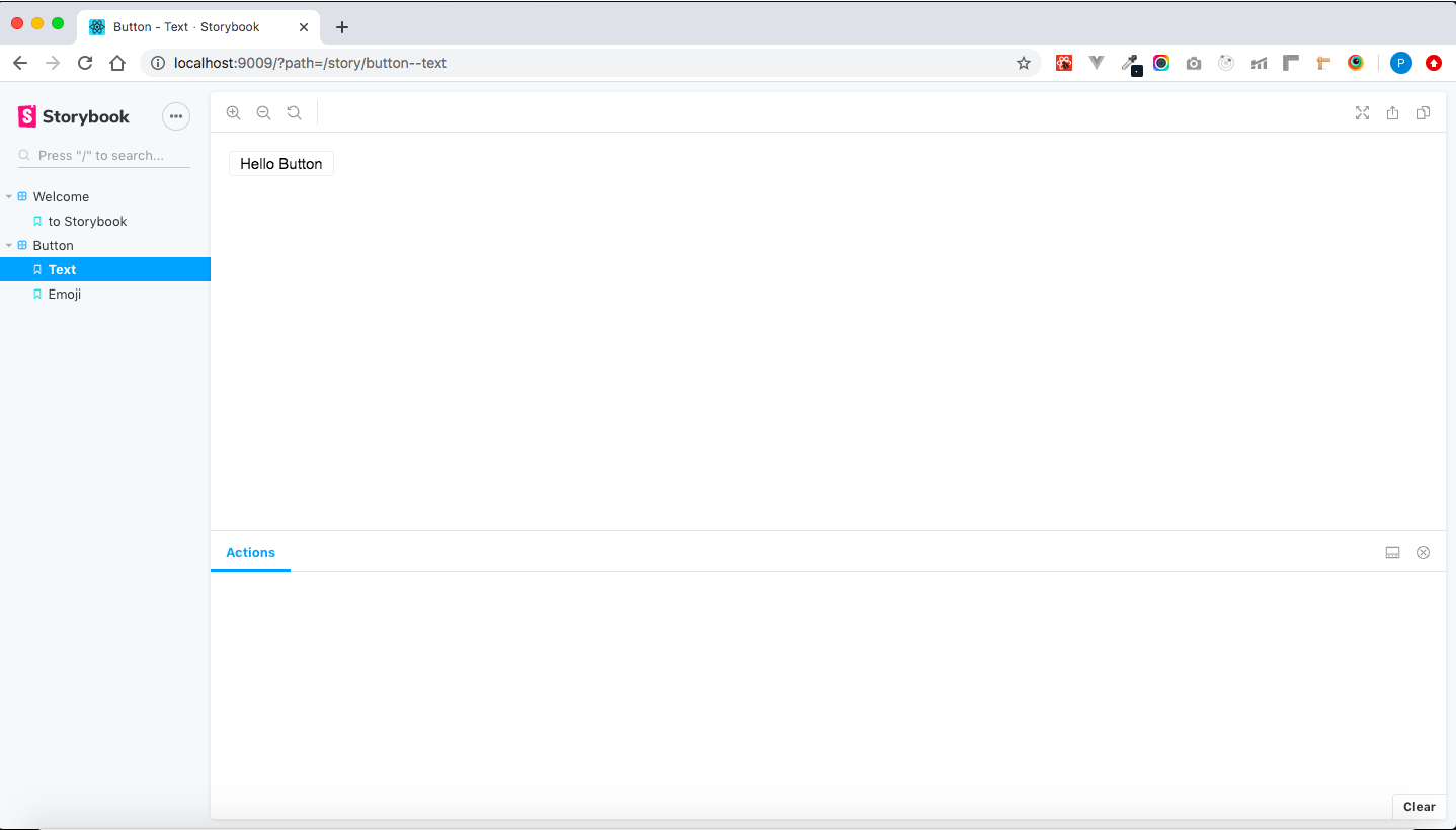
Here is an example of stories for a Button component:
import React from 'react';
import { action } from '@storybook/addon-actions';
import Button from './Button';

export default {
  component: Button,
  title: 'Button',
};

export const text = () => <Button onClick={action('clicked')}>Hello Button</Button>;

export const emoji = () => (
  <Button onClick={action('clicked')}>
    <span>
       Place your custom icon
    </span>
  </Button>
);
Finally:
yarn storybook
This is what you’ll see in Storybook: