Animations using CoordinatorLayout in Android
With the introduction of Material Design, motion and animations became the integral part of Android applications. To make the development easier, Google introduced a new Android Design Support Library. This lets developers focus on the features that make their applications unique rather than focusing on animations part.
The support library contains many new components. Among these components, we can find some powerful ViewGroups like CoordinatorLayout, AppbarLayout, CollapsingToolbarLayout.
Lets look at these elements and how we can use them to perform different scrolling animations such as below:
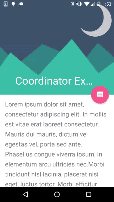
By looking at the image, we can say that views are well coordinated here.
To implement such effect, you may think layout something like:
<RelativeLayout
    ... >
    <ImageView
    ... />
    <Toolbar
    ... />
    <FloatingActionButton
        ... />
    <ScrollView
    ... />
</RelativeLayout>
… and a lots of Java code to coordinate these views.
The problem with this layout is that we have to manage all the events all by yourself. But it will be christmas if we use CoordinatorLayout.
Lets see how we can use CoordinatorLayout to implement the same effect:
<android.support.design.widget.CoordinatorLayout
    ...>
    <android.support.design.widget.AppBarLayout
        ...>
        <android.support.design.widget.CollapsingToolbarLayout
            ...>
            <ImageView
                ... />
            <android.support.v7.widget.Toolbar
                ... />
        </android.support.design.widget.CollapsingToolbarLayout>
    </android.support.design.widget.AppBarLayout>
    <<android.support.v4.widget.NestedScrollView
        ... />
    <android.support.design.widget.FloatingActionButton
        ... />
</android.support.design.widget.CoordinatorLayout>
Now you don’t need to write a single line of Java code and still the animation works smooth and perfect.
So, what are these classes? Lets, have closer look at each of them.
CoordinatorLayout
This layout is a container and a supercharged FrameLayout which provides an additional level of control over touch events between child views.
The special thing about this layout is, as the name suggests, it automates the coordination among its children and helps build beautiful views. All we need to do is wrap activity views inside CoordinatorLayout.
The key to scrolling is CoordinatorLayout class, which receives events from and deliver events to its child views in order for them to respond appropriately. The scrolling view should be either RecyclerView or NestedScrollView.
To enable scrolling, the app:layout_behavior attribute indicates which view will trigger the events in the Toolbar. In this case NestedScrollView.
app:layout_behavior = “@string/appbar_scrolling_view_behavior"AppBarLayout
Basically, an AppBarLayout is a LinearLayout with steroids, their children are placed vertically, with certain parameters the children can manage their behavior when the content is scrolled.
We can manage the behavior of direct childs in an AppbarLayout with the parameter layout_scrollFlags. It indicates to the view how to respond. The real power of an AppbarLayout is caused by the proper management of different scroll flags in their views
app:layout_scrollFlags = “scroll|enterAlways"AppbarLayout Flags
-
scroll: This flag should be set for all views that need to scroll off-screen. Views that don’t use this flag remain pinned to the top of the screen. -
enterAlways: This flag ensures that any downward scroll will cause this view to become visible, enabling the quick return pattern. -
enterAlwaysCollapsed: When a view has declared a minHeight and you use this flag, the view will only enter at its minimum height (collapsed), only expanding to its full height when the scrolling view has reached its top. -
exitUntilCollapsed: This flag causes the view to scroll off-screen until it is collapsed (its minHeight is reached) before exiting. -
snap: Upon a scroll ending, if the view is only partially visible then it will be snapped and scrolled to it’s closest edge.
CollapsingToolbarLayout
This view is designed specifically for wrapping the Toolbar and implement a collapsing app bar. It is designed to be used as a direct child of a AppBarLayout.
Conclusion
Note that, there are multiple types of animations can be implemented using these layouts but the root element here is CoordinatorLayout.
We generally don’t know many details of CoordinatorLayout because things just work out and they work out very well. But it is more powerful than it first seems.
For example, Take a snackbar or a floating action button. Using a CoordinatorLayout, you can ensure that your floating action button will move out of the way when the snack bar pops in.
Well combined and configured these Viewgroups can be very powerful. We can see lots of use of these types of animations are implemented in Google Play applications.